Nicholas wrote:My worry with Sibelius' solution is that it's a lot of extra visual noise. It starts to cover up things like staccato dots and finger hints. Presumably that's a display you'd only turn on briefly in Sibelius, whereas it would be shown in Synthesia for much longer.
I hadn't really spent much time considering the same problem for sheet music. I wonder if you could just get away with different colors on the note heads. The colors are pretty well established in
frequency spectrograms where black/blue might mean "low [velocity]" all the way up to orange/red meaning "high [velocity]".
For the falling notes... I wonder if -- assuming it's alright to lose color as a way to distinguish hands -- the same solution might work. I've heard other suggestions like note width and note opacity as a way to communicate velocity, but I'm not as convinced. Width is a really strong hint about whether you're playing a white or black key. I wouldn't want to weaken that. And I'm not sure opacity is much different than just going full-out and changing the color.
It'd be interesting to see the spectrum colors in a mock-up to show velocity.
Nicholas,
First, I agree about visual noise. That can be a challenge. Whatever solution you choose should be user selectable - at least a Boolean on/off.
When learning and practicing, I go though several stages. First is just learning the song (plink, plink, "damn", plink...). After that it's about musicality nuances - tempo, velocity, etc. The key for me is understanding the difference between how I play (Mr. Clumsy Hands) and how the song should be played (what's in the MIDI file).
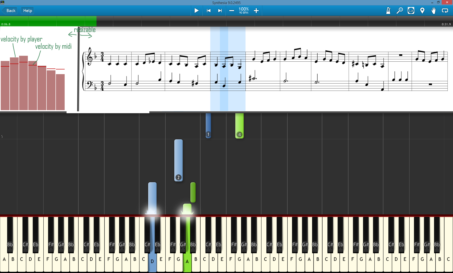
Using different colors has several issues. Color intensity and shade is difficult to discriminate quickly. And some people are color blind. Color + physical size and shape is better in my professional opinion (see p.s. below).
After thinking about this issue, it occurs to me that there may be multiple needs/requirements here:
1. Before playing - User needs to evaluate the music to see how it should be played. A bit of clutter in the UI may be reasonable even at the expense of some visual noise.
2. During playing - During playing user needs to see how it should be played, but may need a cleaner UI. I.e. less visual noise is important. Different colored note heads might work, but this may clash with any future plans you have for displaying multiple voices on one system. For example, Sibelius can display and up to four voice colors per system. For practice, I find this feature very useful.
3. After playing - After I'm finished playing, I try to determine what went well and what did not. This is the analysis phase. IMO, this would require:
- 3a) A "Teacher Review Mode" where the student can review how they did with "teacher" pointers. Essentially, this is a digital recording of the user's performance with visual indicators to allow the user to see their errors as they made them. This could include missed notes, tempo issues, and velocity mismatches.
- 3b) In "Teacher Review Mode" visual clutter would be of minimal importance as long as the user could quickly turn analysis indicators on and off with push buttons (or some other control) at the top of the "replay" page.
I these ideas are useful.
Regards,
Dan.
p.s I've been developing analytical systems since 1981. Clear data presentation is always a challenge that I continuously wrestle with even today. Each person wants their own customized view of the data. And what is clear to one person is "clear as mud" to someone else.